
This is my first 'you decide' lesson. Working towards student led learning.The prepare task is a photo from 101 questions. The lesson may not get past this page. Pupils will develop questions, we will write what we feel are the best out onto A3 paper - stick them on the wall and see what happens. If good questions arise, there is flow and learning in the lesson then we will follow it to wherever it goes. Pupils will be given a choice of what they want to pursue and decide if new questions need to be asked or if we have found enough answers. The 'wall posts' are to try and develop collaborative learning skills that we will need later when we start learning on the Wiki. I am trying to get pupils to follow their own interests, rather than waiting for direction from me. They can move from question to question, write new ones at any time and feedback on other pupils work.
The main part of the lesson is taken straight from the article in the TES this week by Mr Barton Maths, although I have used a different picture. The content on the flipchart is deliberately sparse - it is to prompt discussion and questioning only. It is clear from the levels and introduction of stem and leaf that I have a direction I want to take the pupils but at all points they will have options.They will organise the data initially as they see fit. Once we have worked out the averages which they will do collaboratively as between us we will know how to work them all out (if noone else does I will guess wildly high to distort the mean) we will discuss which one is best to use, whose data was easiest to work with, why, and so on. Then we will redo the whole experiment (show the dots for just a couple of seconds - then pupils guess). Pupils will again choose how they want to present the data, my hope is that they see the benefits of stem and leaf, if they have a better way of their own they can try it and we will compare at the end.Here we can also discuss influence and compare the two sets of data (effect on the range etc).
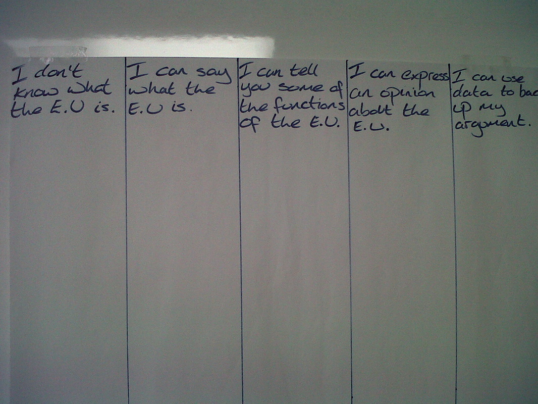
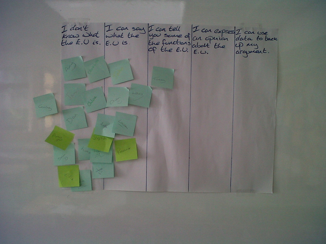
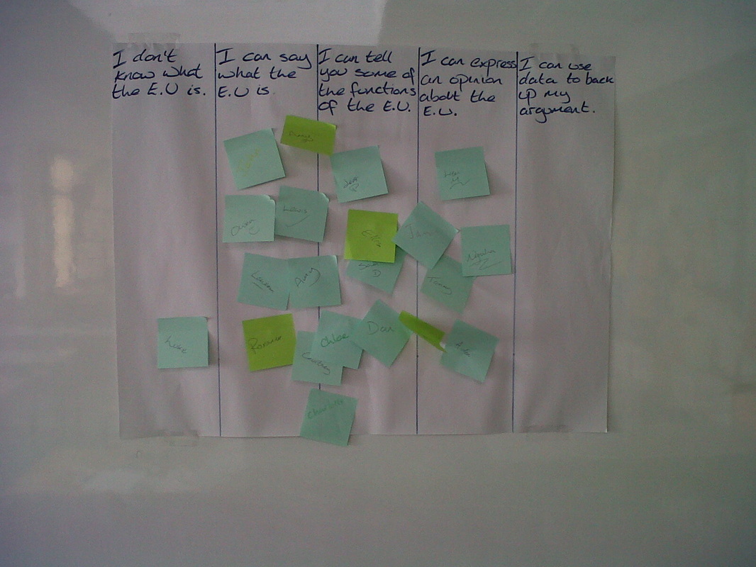
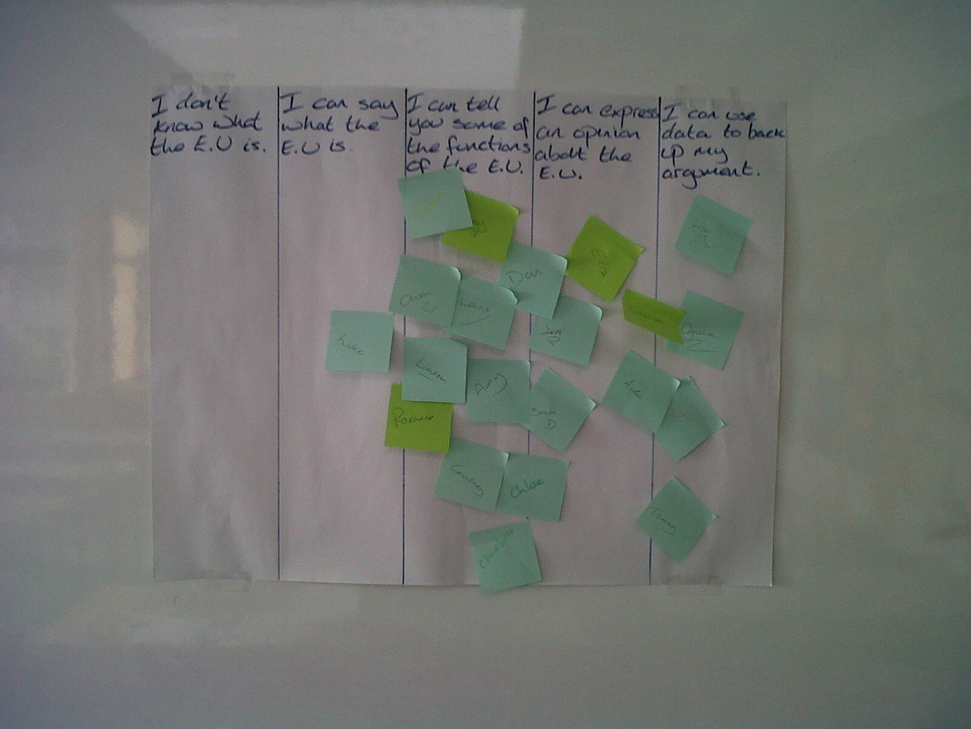
At the end of the lesson/ lessons pupils will be able to see which levels they have achieved and be asked to justify why they have done so in their books. On levels, I have deliberately introduced the first set of levels before we share our first guesses as pupils will be listening in keenly here expecting to get an answer.
The main part of the lesson is taken straight from the article in the TES this week by Mr Barton Maths, although I have used a different picture. The content on the flipchart is deliberately sparse - it is to prompt discussion and questioning only. It is clear from the levels and introduction of stem and leaf that I have a direction I want to take the pupils but at all points they will have options.They will organise the data initially as they see fit. Once we have worked out the averages which they will do collaboratively as between us we will know how to work them all out (if noone else does I will guess wildly high to distort the mean) we will discuss which one is best to use, whose data was easiest to work with, why, and so on. Then we will redo the whole experiment (show the dots for just a couple of seconds - then pupils guess). Pupils will again choose how they want to present the data, my hope is that they see the benefits of stem and leaf, if they have a better way of their own they can try it and we will compare at the end.Here we can also discuss influence and compare the two sets of data (effect on the range etc).
At the end of the lesson/ lessons pupils will be able to see which levels they have achieved and be asked to justify why they have done so in their books. On levels, I have deliberately introduced the first set of levels before we share our first guesses as pupils will be listening in keenly here expecting to get an answer.
| dotty_averages.notebook |
 RSS Feed